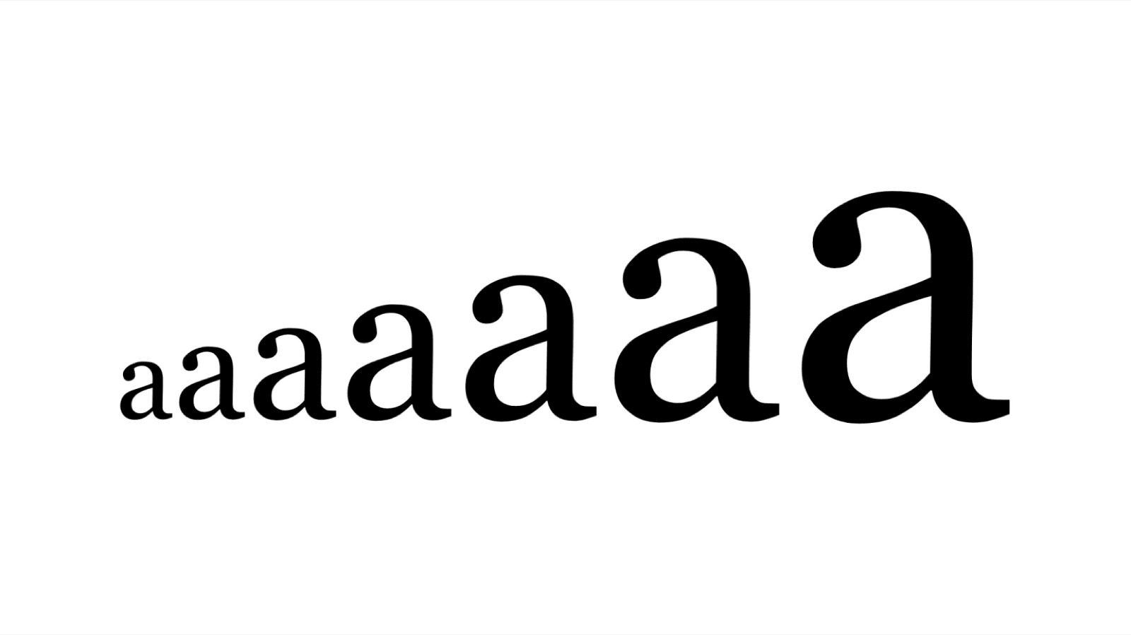
Typeface
Typefaces are the foundation of accessibility, so choose one that enhances legibility and readability. Use a font appropriate to your audience, where letters are easily distinguishable. Some typefaces have nearly identical forms for multiple letters, so ensure that letters such as d and b, or q and p, are obviously unique in shape.
Colour
Every disability, impairment and individual is unique, so there's no perfect palette. But make sure text stands out against the background, ideally a dark colour against a light one. Soft, calm and dark colours can encourage focus, and the colours you choose should never hinder readability.
Size and spacing
Text and images need to be large enough for the content, the audience and the reading environment. Use relative sizing so text scales with screen size. Make sure your text has sufficient line spacing, so the eye can track from one line to the next with ease. The Web Content Accessibility Guidelines recommend a value of 1.5 for body copy. Break up content with subheadings, images and video to aid comprehension.
Layout
The best design is simple and uncluttered. Keep sections clearly defined with headings. In elements such as forms, allow plenty of space, with boxes as large as possible. Make sure text is split up, with no large blocks of text at once.
Alternatives
Provide alternatives for all non-text content, so someone who cannot perceive information in one channel has equivalent access in another. Transcripts and captions make audio and video more accessible. Alt-text describes images, giving context to users on screen readers, so be descriptive but keep it to the point.
By focusing on accessibility you enhance the experience for every visitor, and show your customers that you value them as individuals. At Goodthing, we practise what we preach. As you go through this site, we've focused on making it accessible to everyone through its design, with colour combinations that reach AA and AAA standards, and fonts and spacing that ensure clarity for anyone.